
KeystrokePicker - A Case Study in Composable Subcomponents - Part 2
This is the second part of a case study in how I refactored our
KeystrokePicker component into composable subcomponents. If you missed the
first part, which describes the architectural pattern in React and specific
details on our implementation, you can
read it here.
In this article, I'm going to focus on issues I encountered with performance and interoperability of third-party libraries, while implementing this pattern along with solutions and fixes I came up with.
Performance
While I was carrying out the refactor and new feature addition, it became apparent there were a few areas of the code with performance issues:
- Typing the search query into the input was laggy
- Rendering the menu was slow
These were related since setting the search query was tightly coupled to filtering the item list and rendering the menu.
Slow Input Updates
This is a pretty common performance problem in React, generally because the
state update which holds an input's value also triggers some other expensive
computation and/or render - in our case it was doing both 😊
Historically this is where you'd normally reach for debounce, but these days
we have
React's own useDeferredValue hook.
The relevant parts of our KeystrokePicker.Provider were therefore updated to:
const [searchValue, setSearchValue] = useState('');
const deferredSearchValue = useDeferredValue(searchValue);

// Filter the items array with the deferred value, not the search value,
// utilizing the filter callback prop
const filteredItemValues = useMemo(() => {
  return items
    .filter((item) => filter(item, deferredSearchValue))
    .map((item) => item.value);
}, [items, filter, deferredSearchValue]);

const {
  getMenuProps,
  getInputProps,
  getComboboxProps,
  getItemProps,
  toggleMenu,
  isOpen,
  highlightedIndex,
  setHighlightedIndex,
  selectedItem,
} = useCombobox({
  defaultHighlightedIndex: 0,
  selectedItem: null,
  // Pass the deferred value and the filtered items here
  inputValue: deferredSearchValue,
  items: filteredItemValues,
});
The searchValue and setSearchValue properties are then exposed via the
KeystrokePicker's Context and passed to the underlying input element. Doing
this decouples the search field's render update from the expensive computation
and render and immediately improved typing lag.
Slow Menu Rendering
Our existing implementation hadn't made any attempt to memoize rendering menu
items (or selected tokens for that matter). When I say memoizing here, I'm
specifically referring to wrapping the component in React.memo to prevent
re-renders unless props actually change:
The relevant part of KeystrokePickerMenu is:
{
  filteredItemValues.map((itemValue, index) => {
    const item = itemsByValue[itemValue];
    const itemProps = getItemProps({
      item: itemValue,
      index,
      disabled: item.disabled,
    });
    const isHighlighted = isOpen && itemProps['aria-selected'] === 'true';
    const isSelected = selectedItemValues.includes(itemValue);

    return (
      <div
        className={classnames(
          styles.availableItem,
          isHighlighted && styles.availableItemHighlighted,
          isSelected && styles.availableItemSelected,
          item.disabled && styles.availableItemDisabled
        )}
        key={itemValue}
        aria-label={item.label}
        {...itemProps}
      >
        {renderItem(item, {
          highlighted: isHighlighted,
          selected: isSelected,
        })}
      </div>
    );
  });
}
The trouble here is that memoizing this is very tricky. Because of the way
Downshift works internally: getItemProps is the prop getter Downshift provides
to give you (unsurprisingly) all the props for each item. Now getItemProps is
stable, but the results of calling it aren't, so:
- If you pass
getItemPropsto a memoized component, it will never_ rerender, including when you wanted it to - like when it becomes highlighted or selected! - If you pass the result of
getItemPropsto a memoized component, it will always rerender, since all the event handlers are recreated each time it's called.
Both of these options are obviously useless :)
You could try to manually memoize these handlers yourself by looking for the specific Downshift state which affects their stability, but this also seems like a bad idea to me - it's brittle, and you're at the mercy of any future updates to the library. So what should we do? ...let's just ignore it.
...No, this isn't an exercise in avoidance! When I say ignore it, I mean let's
just forget about the updates to that outer div and leave it to React to
handle the performance. It's not going to be the end of the world. Let's
concentrate on the part that we do have control over, the part which is
actually more likely to be expensive to render - the contents of that div
provided by the renderItem prop. Now, we don't have control over what that
actually returns so we can only encourage the consumer to memoize that - but we
can memoize the result of the callback itself:
type KeystrokePickerMenuItemProps<TItem extends KeystrokePickerValueItem> =
  HTMLProps<HTMLDivElement> & {
    item: TItem;
    isSelected: boolean;
    isHighlighted: boolean;
    renderItem: KeystrokePickerRenderItemCallback<TItem>;
  };

// So we can't wrap this in `React.memo` because the props are never stable...
function KeystrokePickerMenuItem<TItem extends KeystrokePickerValueItem>({
  item,
  isSelected,
  isHighlighted,
  renderItem,
  ...props
}: KeystrokePickerMenuItemProps<TItem>) {
  // ...but all of these params *are stable*, so `renderItem` won't be called
  // unless they change - we've now memoized the expensive part!
  const renderedItem = useMemo(() => {
    return renderItem(item, {
      highlighted: isHighlighted,
      selected: isSelected,
    });
  }, [isHighlighted, isSelected, item, renderItem]);

  return (
    <div
      className={classnames(
        styles.menuItem,
        isHighlighted && styles.menuItemHighlighted,
        isSelected && styles.menuItemSelected,
        item.disabled && styles.menuItemDisabled
      )}
      key={item.value}
      aria-label={item.label}
      {...props}
    >
      {renderedItem}
    </div>
  );
}

// The relevant part of `KeystrokePickerMenu` now becomes:
{
  filteredItemValues.map((itemValue, index) => {
    const item = itemsByValue[itemValue];
    const itemProps = getItemProps({
      item: itemValue,
      index,
      disabled: item.disabled,
    });
    const isHighlighted = isOpen && itemProps['aria-selected'] === 'true';
    const isSelected = selectedItemValues.includes(itemValue);

    return (
      <KeystrokePickerMenuItem
        {...itemProps}
        key={item.value}
        item={item}
        isSelected={isSelected}
        isHighlighted={isHighlighted}
        renderItem={renderItem}
      />
    );
  });
}
This exact same pattern can also be used to improve performance for the selected
tokens too. The relevant Downshift prop-getter in that case is
getSelectedItemProps.
There's obviously been a lot of excitement lately (well for a couple of years now!) about React Compiler coming in React 19, and it might be tempting to think that in the near future we can ignore memoization techniques such as those described above. Honestly I would love this too! However, it's worth noting that at the time of writing, while it's still in experimental stages, early testing suggests that we're still very much going to need to understand these concepts and tweak code to get the full benefits, especially for more complex memoization patterns.
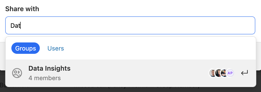
Bonus Performance Issue - Virtualization
So after both of the above fixes were implemented, the KeystrokePicker became
a lot more performant, but there was still an area that was problematic. You
can see from the designs that the menu item for a Group has quite a bit more
going on than for a User:

- It has an SVG logo (rendered in the DOM) rather than just an
img - It has a stack of icons for Users who belong to that Group.
In my working environment I had just over 150 groups and even with this it took
over a second for the KeystrokePicker.Menu to appear on initial render!
Rendering the SVG with an img tag helped, but not enough. It was pretty clear
we needed to use a virtualized list instead.
Our library of choice for this is react-virtuoso and
there were a few challenges getting this to play nicely with Downshift (detailed
below in Library Interoperability), not least because Virtuoso's docs leave a
lot to be desired!
The main changes look like this:
// Our filteredItemValues.map callback you know and love
const renderItemContent = useCallback(
  (index: number, itemValue: string) => {
    const item = itemsByValue[itemValue];
    const itemProps = getItemProps({
      // pass ref as separate prop to avoid TS generics issues with forwardRef
      refKey: 'forwardedRef',
      item: itemValue,
      index,
      disabled: item.disabled,
    });
    const isHighlighted = isOpen && itemProps['aria-selected'] === 'true';
    const isSelected = selectedItemValues.includes(itemValue);

    return (
      <KeystrokePickerMenuItem
        {...itemProps}
        key={itemValue}
        item={item}
        isSelected={isSelected}
        isHighlighted={isHighlighted}
        renderItem={renderItem}
      />
    );
  },
  [getItemProps, isOpen, itemsByValue, renderItem, selectedItemValues]
);

// The relevant part of `KeystrokePicker.Menu` now becomes:
return <Virtuoso data={filteredItemValues} itemContent={renderItemContent} />;
We're now only rendering approximately 7 items at once, which unsurprisingly had a massive performance gain. At this point, the whole control felt highly responsive and was ready for shipping.
Other Ideas
I did also consider splitting the Context in two, one just for the search related state and actions, another for everything else. Since the input is the only component that would need to read from the Search Context, this would minimize subcomponent renders. In this case, I decided against it because the above improvements had already made the component very snappy and the additional code complexity didn't feel worth it:
- Additional complexity at the
KeystrokePicker.Providerlevel, setting up and separating state/actions out into separate Contexts - All the subcomponents would need wrapping in
React.memosince any parent Context update always re-renders all thechildren. Doing this seems overkill since otherwise all other state is very interconnected. - Premature optimization is the root of all evil and all that.
Library Interoperability or "How to Get Downshift and React Virtuoso to Play Nicely"
There were a couple of challenges here:
- Scroll into view functionality when using the arrow keys to navigate the menu
- Shrinking the virtualized menu to fit with smaller numbers of items
Scroll Into View
Downshift provides its own scroll into view functionality out of the box. Unfortunately, this depends upon the item to be scrolled to being present in the DOM, which obviously may not possible for a virtualized list. It also relies on the scroll container being a specific element under Downshift's control.
While it is possible to pass a custom scroller through to Virtuoso as a prop,
I found this problematic. Consider:
const customScrollerRef = useRef<HTMLDivElement | null>(null);

return (
  <div ref={customScrollerRef}>
    <Virtuoso
      customScrollParent={customScrollerRef.current}
      data={filteredItemValues}
      itemContent={renderItemContent}
    />
  </div>
);
On the first render customScrollerRef will be null, so Virtuoso will be
rendered with its own internal scroller. Only on subsequent renders will we get
the scroll container we expect. This wasn't acceptable for our use case, so we
need to use Virtuoso's own internal scroller.
Virtuoso provides its own imperative scrollIntoView API, which expects the
index of the item to scroll to, we should be able to leverage that to connect
both items.
Although undocumented (it's in its TypeScript definitions though! 😅), there's a
Downshift prop called scrollIntoView, which allows you to customize this
functionality. Even then, it still relies on DOM nodes rather than providing the
desired highlightedIndex state from its internals. After opening
an issue on the
Downshift GitHub, I was pointed in the direction of a
virtualization example
in the docs! It uses the onHighlightedIndexChange callback to actually
implement the scroll into view functionality, overriding the scrollIntoView
prop to do nothing. Leveraging that, we could tweak it for our use case:
const virtuosoApiRef = useRef<VirtuosoHandle | null>(null);

const handleHighlightedIndexChange = useCallback<
  NonNullable<UseComboboxProps<string>['onHighlightedIndexChange']>
>(({ highlightedIndex, type }) => {
  // There are various reasons that the highlightedIndex can change (during
  // mouse hovers for example). We only want to do it for arrow keys and
  // explicit calls:
  const scrollForStateChangeTypes: UseComboboxStateChangeTypes[] = [
    useCombobox.stateChangeTypes.InputKeyDownArrowUp,
    useCombobox.stateChangeTypes.InputKeyDownArrowDown,
    useCombobox.stateChangeTypes.FunctionSetHighlightedIndex,
  ];

  if (
    highlightedIndex === -1 ||
    highlightedIndex === undefined ||
    !scrollForStateChangeTypes.includes(type)
  ) {
    return;
  }

  virtuosoApiRef.current?.scrollIntoView({
    index: highlightedIndex,
    behavior: 'auto',
  });
}, []);

const {
  // downshift stuff :)
} = useCombobox({
  // ...other props
  scrollIntoView: () => {},
  onHighlightedIndexChange: handleHighlightedIndexChange,
});
The virtuosoApiRef then just needs attaching to the Virtuoso instance inside
the KeystrokePicker.Menu. It can also be passed down via Context:
const { virtuosoApiRef, filteredItemValues } = useKeyStrokePickerContext();

return (
  <Virtuoso
    ref={virtuosoApiRef}
    data={filteredItemValues}
    itemContent={renderItemContent}
  />
);
Bonus Downshift Scroll Container
Remember earlier I mentioned I didn't really like having to make the Group /
User menu UI position: sticky? This feels kinda hacky to me, but it would also
cause issues where scrolling a top menu item into view would make it appear
underneath the menu:

Because we're no longer using Downshift's own scroll container, the above solution fixes this problem.
However, in our production code we allow virtualization to be optional, and in some cases we even apply it automatically based on the number of menu items. This left a sour taste in my mouth:
- Removing the
position: stickyhack was only possible when virtualizing items - The UI looked and behaved ever so slightly differently when and when not virtualizing items
But our virtualized solution also lays the groundwork for solving this for the standard use case too. We can provide a custom scroll container to downshift all the time.
Unfortunately downshift doesn't export its internal default scroll into view
util. We could write our own, but I just duped theirs into our codebase,
installing compute-scroll-into-view, which is a dependency of Downshift:
// Default scrollIntoView copied from Downshift
function downshiftDefaultScrollIntoView(
  node: HTMLElement,
  menuNode: HTMLElement
) {
  if (!node) {
    return;
  }

  const actions = computeScrollIntoView(node, {
    boundary: menuNode,
    block: 'nearest',
    scrollMode: 'if-needed',
  });
  actions.forEach((action) => {
    const { el, top, left } = action;
    el.scrollTop = top;
    el.scrollLeft = left;
  });
}

const scrollerRef = useRef<HTMLDivElement | null>(null);

const customScrollIntoView = useCallback<
  NonNullable<UseComboboxProps<string>['scrollIntoView']>
>((node) => {
  if (!scrollerRef.current) {
    return;
  }
  downshiftDefaultScrollIntoView(node, scrollerRef.current);
}, []);

const {
  // downshift stuff :)
} = useCombobox({
  // ...other props
  // Now we pass different callbacks to Downshift depending on if we're
  // virtualizing or not, but our UI will behave the same in either case:
  scrollIntoView: willVirtualize ? () => {} : customScrollIntoView,
  onHighlightedIndexChange: willVirtualize
    ? handleHighlightedIndexChange
    : undefined,
});
As with our virtualized menu, we can add scrollerRef to the Context and wire
it up where we need to inside KeystrokePicker.Menu:
const { scrollerRef, filteredItemValues } = useKeyStrokePickerContext();

// relevant render code:
<div ref={scrollerRef} className={styles.vanillaScrollContainer}>
  {filteredItemValues.map((itemValue, index) =>
    // map using the same renderItemContent callback that Virtuoso does
    renderItemContent(index, itemValue)
  )}
</div>;
Shrink To Fit
While specific to our use case, rendering the menu in a Popover, we also needed
Virtuoso to shrink to fit. We were able to leverage Virtuoso's
totalListHeightChanged callback to achieve this. We don't necessarily always
want this functionality, when the KeystrokePicker is rendered inline for
example, hence why it's controlled by an enabled parameter.
export function useShrinkToFitVirtuosoStyle({
  maxHeight,
  enabled = false,
}: {
  maxHeight?: number;
  enabled?: boolean;
}) {
  // Use 1 as the initial height rather than maxMenuHeight, otherwise there can
  // be a flash of a large menu before setTotalListHeight is updated with the
  // correct value. We can't use 0 otherwise Virtuoso won't render at all.
  const [totalListHeight, setTotalListHeight] = useState(1);
  const shouldShrinkToFit = enabled && maxHeight !== undefined;

  const style = useMemo(() => {
    if (!shouldShrinkToFit) {
      return undefined;
    }

    return {
      height: Math.min(maxHeight, totalListHeight),
    };
  }, [maxHeight, shouldShrinkToFit, totalListHeight]);

  return {
    style,
    setTotalListHeight: shouldShrinkToFit ? setTotalListHeight : undefined,
  };
}
Our final Virtuoso renderer therefore looks something like this:
const { virtuosoApiRef, filteredItemValues } = useKeyStrokePickerContext();

const { style, setTotalListHeight } = useShrinkToFitVirtuosoStyle({
  // maxHeight and shrinkToFit are props of the containing component
  maxHeight,
  enabled: shrinkToFit,
});

return (
  <Virtuoso
    ref={virtuosoApiRef}
    style={style}
    data={filteredItemValues}
    totalListHeightChanged={setTotalListHeight}
    itemContent={renderItemContent}
  />
);
And you can see the Menu shrinks to fit as desired when filtering items:
Conclusion
This was a pretty dense case study, so well done if you made it here!
We tackled:
- Breaking apart an existing component - our
KeystrokePickerinto composable subcomponents - Performance issues encountered along the way and solutions for them
- Library interoperability issues encountered along the way and solutions for them
Hopefully, from this post and its previous part, you can see how useful and powerful this pattern can be. If you found the technical problems outlined here interesting and believe you can help us with similar challenges, please keep an eye on our careers page.