
KeystrokePicker - A Case Study in Composable Subcomponents - Part 1
Recently for our new Group Sharing feature, I was tasked with adding a new form control to our Edit Smart View Modal, in order for a user to be able to choose the Groups and Users they wish to share the Smart View with. The UI for this was based on an existing control we use to create Groups in the first place, but with quite a few key differences, both visual and behavioural. Looking at the UI side-by-side, apart from some minor style updates, which would be applied in both places, you can see the new feature needed to display the menu in a Popover rather than inline below the search input. This seems like a minor design change, but has pretty significant code implications, especially since we want to be able to retain both UI patterns.
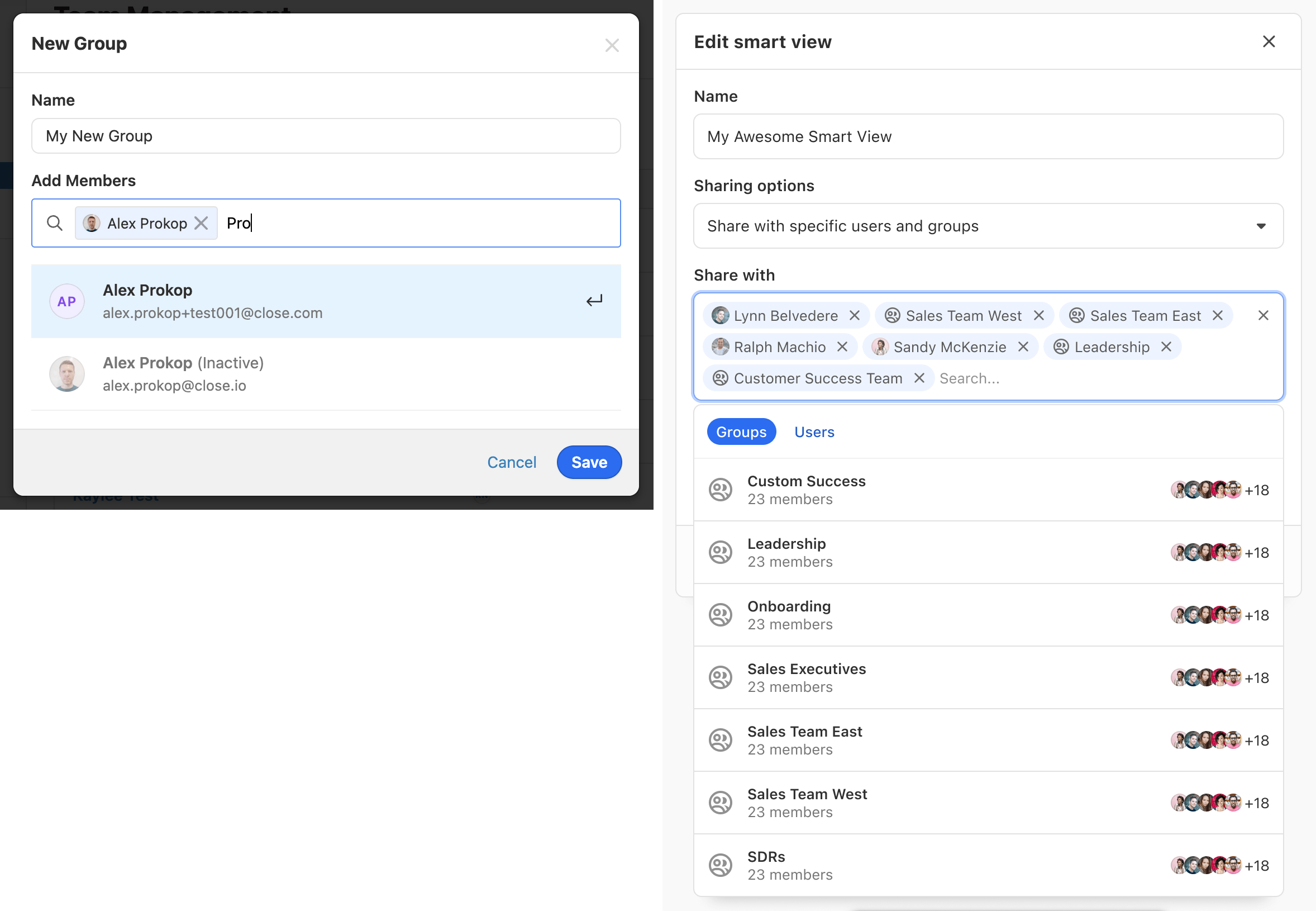
See the existing KeystrokePicker design above left, where the menu is always visible inline; and the new design on above right, where the menu is in a dropdown.
Looking at this design my immediate thought was - this is a job for composable subcomponents! To be honest, I think most React components would benefit from being composable subcomponents, but complex UI like this, which is built up from related pieces and shared state, is a perfect candidate.
I'm going to break this case study down into two articles:
- Architecture - a general description of the pattern, followed by details of how I implemented this specific component
- Performance and Library Interoperability - details of issues I encountered while implementing this pattern and their related solutions
Architecture
So What Are Composable Subcomponents Anyway?
Well, it's generally widely accepted as a React best practice to keep components as small as possible. This is beneficial for several reasons:
- Single Responsibility
- Easier to read
- Easier to maintain
- Easier to test
- Reduced branching logic, so smaller surface area for bugs
That's all very well when you're building a button, but what about a more complex component like this where there's a lot of interconnected state and logic? You can obviously start by breaking apart the internals into smaller pieces, but often these smaller components are kept private to the implementation, and you still end up with what I - less than affectionately - like to call "monolithic black box components". Sometimes when these are first built and used in a single place, they're just about OK, but they fall down very quickly as soon as you need to customize them - especially to the extent of what we need to do in this case. What can often happen, if you're not careful, is super ugly scope creep, where you end up with an enormous and unknowable props API to handle rendering them in a multitude of unrelated ways. This is bad for basically the exact opposite reasons as listed above:
- Multi Responsibility
- Hard to read
- Hard to maintain (and any time you want to change / add new features it's very easy to add regressions)
- Hard to test
- Lots of branching logic, so large surface area for bugs
This is where the composable subcomponents part comes in. I've heard this called
other things, I think
compound components
is also a common term. Basically you expose the building blocks of the
components and allow the consumer to glue them together as necessary - think
native HTML select and option elements. Sometimes this means consumers need
to write a little more boilerplate, but the greater flexibility is worth the
extra lines. You can always wrap the composed component into individual concrete
instances for specific purposes too. This pattern also enables some really
powerful extensibility - which I'll detail a little later - that just wouldn't
be possible otherwise.
So how do these components communicate with each other internally? It's not a
requirement of this pattern, but generally React Context is the simplest and
best way to wire them up. You can also use cloneElement and allow parent
components to pass props down to their children, but this is a bit magic and
more importantly brittle. It forces you to wire subcomponents up in particular
ways, which is exactly what we're trying to avoid.
It's use is also discouraged by the React team themselves.
Context sometimes gets a bad performance rep (and we've been waiting far too long for useContextSelector!), but in this case, where virtually all the components depend upon one another anyway, it's the perfect tool for the job and keeps the subcomponents as loosely coupled as possible.
Breaking Apart KeystrokePicker
So enough of the theory, how can we break apart an existing black box component
into a composable one? This is more of an art than a science, but a big part of
the decision-making should be how you actually want to use it and which parts
need to be more flexible. You'll obviously also need to audit the existing code
too. Our existing KeystrokePicker was around 400 lines of code with a props
API that looked like this:
export type KeystrokePickerValueItem = {
  value: string;
  label: string;
  disabled?: boolean;
};

export type KeystrokePickerRenderItemCallback<
  TItem extends KeystrokePickerValueItem,
> = (
  item: TItem,
  props: {
    highlighted: boolean;
    selected?: boolean;
  }
) => ReactNode;

export type KeystrokePickerRenderTokenCallback<
  TItem extends KeystrokePickerValueItem,
> = (
  item: TItem,
  props: {
    removeElement: ReactNode;
    focused: boolean;
  }
) => ReactNode;

export type KeystrokePickerFilterCallback<
  TItem extends KeystrokePickerValueItem,
> = (item: TItem, searchQuery: string) => boolean;

export type KeystrokePickerProps<TItem extends KeystrokePickerValueItem> = {
  /**
   * The items to render in the menu, extends KeystrokePickerValueItem
   */
  items: TItem[];
  /**
   * The currently selected values to control the component
   */
  value: string[];
  /**
   * Callback to receive changed values
   */
  onValueChange: (nextValues: string[] | undefined) => void;
  /**
   * Render prop callback to allow for custom rendering each item in the menu
   */
  renderItem?: KeystrokePickerRenderItemCallback<TItem>;
  /**
   * Render prop callback to allow for custom rendering each selected token
   */
  renderSelectedToken?: KeystrokePickerRenderSelectedTokenCallback<TItem>;
  /**
   * A filter callback to handle filtering the list when a query is entered in the input
   */
  filter?: KeystrokePickerSearchCallback<TItem>;
  /**
   * A message to render when the list is empty
   */
  noAvailableItemsMessage?: ReactNode;
  /**
   * A message to render when a search query returns no results
   */
  noMatchingItemsMessage?: ReactNode;
  /**
   * Placeholder for the text input
   */
  placeholder?: string;
  /**
   * Whether to render items in the menu after they've been selected
   */
  persistSelectedItems?: boolean;
  /**
   * Whether to render selected tokens in the input
   */
  useTokens?: boolean;
  /**
   * Whether multiple selection is allowed
   */
  isMulti?: boolean;
};
Thankfully, we didn't have too much of an unwieldy props API here, so we're
probably not going to lose too many of these. What will happen though, is these
props will be spread out amongst the subcomponents making them easier to
understand contextually based on the component they belong to, thus reducing the
number of props per component. useTokens is also a great example of a prop we
can kill, we can create a subcomponent to handle token rendering and then just
not use it if we don't want to display tokens.
For the new composable API, I initially spit-balled some ideas back and forth with our Design System Tech Area Lead (Hey Scott! 👋) and came up with how I might want to use these components in the consumer.
Replacing the existing inline usage:
<KeystrokePicker.Provider
  items={items}
  value={value}
  onValueChange={onValueChange}
  filter={search}
>
  <KeystrokePicker.InlineWrapper>
    <KeystrokePicker.Input
      tokens={<KeystrokePicker.Tokens renderToken={renderUserToken} />}
    />
    <KeystrokePicker.Menu
      renderItem={renderUserItem}
      noAvailableItemsElement={noAvailableItemsElement}
      noMatchingItemsElement={noMatchingItemsElement}
    />
  </KeystrokePicker.InlineWrapper>
</KeystrokePicker.Provider>
It's common to expose these components on a single object, so you don't have to
import them all independently. In this case KeystrokePicker is just an object,
but you can also hang the subcomponents from a top level root component if you
have one. Commonly you'll use the standard children API to do the gluing, but
you may also sometimes want to add custom props for this too. See the tokens
prop on KeystrokePicker.Input. Sometimes you'll need to do this because you
need to use children for another component, but in this case tokens just
makes more semantic sense, especially since it's an optional prop. You can also
see how the props have been spread out amongst the subcomponents. I've also
allowed for passing in a completely custom React Node to handle no available
items and no matching items.
For the new Popover version of the component, I came up with:
<KeystrokePicker.Provider
  items={items}
  value={value}
  onValueChange={onValueChange}
  filter={search}
>
  <KeystrokePicker.Popover
    anchor={
      <KeystrokePicker.Input
        tokens={<KeystrokePicker.Tokens renderToken={renderUserToken} />}
      />
    }
  >
    <KeystrokePicker.Menu
      renderItem={renderUserItem}
      noAvailableItemsElement={noAvailableItemsElement}
      noMatchingItemsElement={noMatchingItemsElement}
    />
  </KeystrokePicker.Popover>
</KeystrokePicker.Provider>
Simple, huh? You can see in this case that virtually nothing has changed, but
rather than rendering a KeystrokePicker.InlineWrapper we're rendering a
KeystrokePicker.Popover instead. Coming up with the API might take a little
bit of trial and error, but for the most part you'll likely be moving around
existing code into different components to see what works. In our case the
KeystrokePicker.Provider is the workhorse - we use
Downshift to handle the dropdown logic and
keyboard accessibility features - and this is all setup in
KeystrokePicker.Provider:
- We initialize the
searchValuestate for the input - Filter the items array, based on this value and the
filtercallback - Pass the controlled
valueprop through to Downshift'suseMultipleSelectionhook - Pass the
searchValueand filtered items through to Downshift'suseComboboxhook - Do a few other customizations that we pass through to Downshift as params
- Set up a
React.Contextand pass all the relevant state and actions through to its Provider'svalueas a memoized object.
Now actually implementing the individual subcomponents is very simple, you just need to pull the necessary pieces from Context and wire them up.
What's All This About Powerful Extensibility?
So if you look at the new version of the KeystrokePicker we need for group
sharing, we also have some header UI in the menu, to switch the lists between
displaying Groups or Users.
There are a few challenges here:
- We need to build some external state for the active tab, but also have it interact with internal Downshift state
- We'd like to enhance Downshift's keyboard functionality by allowing users to select the tab they want with the arrow keys
- We also need to render the UI inside Downshift's designated menu component, otherwise when it's interacted with Downshift considers it effectively blurring the component, which will automatically close the menu!
The "powerful extensibility" describes how, with this architecture, it's
possible for the consumer to compose existing subcomponents by rendering them
inside custom wrapper components. The magic here is that these consumer-specific
subcomponents have access to the compound component's Context, so can interact
with it in ways that simply wouldn't be possible from the outside only. In fact,
you could even completely rewrite and replace the existing subcomponent if the
desire took you. This ability, a form of
Inversion of Control, also
helps to keep the props API slim, since you won't be adding additional stuff to
allow for a particular customization that's only used in a single place. Let's
look at how we leveraged that for adding tabs to KeystrokePicker for our Group
Sharing functionality:
/**
 * For this example it's not really important what UserKeystrokePickerValueItem
 * and GroupKeystrokePickerValueItem look like, but they both extend KeystrokePickerValueItem
 */

export type TabId = 'Users' | 'Groups';

export type SharedWithUserKeystrokePickerValueItem =
  UserKeystrokePickerValueItem & {
    isGroup: false;
  };

export type SharedWithGroupKeystrokePickerValueItem =
  GroupKeystrokePickerValueItem & {
    isGroup: true;
  };

export type SharedWithKeystrokePickerValueItem =
  | SharedWithUserKeystrokePickerValueItem
  | SharedWithGroupKeystrokePickerValueItem;

export type SavedSearchSharedWithKeystrokePickerMenuProps = {
  hasHeaderMenu: boolean;
  orgHasGroups: boolean;
  activeTab: TabId;
  setActiveTab: (newActiveTab: TabId) => void;
};

export default function SavedSearchSharedWithKeystrokePicker({
  items,
  value,
  onValueChange,
}: SavedSearchSharedWithKeystrokePickerProps) {
  const [activeTab, setActiveTab] = useState<TabId>('Groups');
  const isGroupsTab = activeTab === 'Groups';

  const filter = useCallback(
    (item: SharedWithKeystrokePickerValueItem, needle: string) => {
      const { isGroup } = item;

      if (activeTab === 'Users') {
        return !isGroup && searchUser(item, needle);
      }
      return isGroup && defaultSearch(item, needle);
    },
    [activeTab]
  );

  return (
    <KeystrokePicker.Provider
      items={items}
      value={value}
      onValueChange={onValueChange}
      filter={filter}
    >
      <KeystrokePicker.Popover
        anchor={
          <SavedSearchSharedWithKeystrokePickerInput
            setActiveTab={setActiveTab}
          />
        }
      >
        <KeystrokePicker.Menu
          noAvailableItemsElement={
            isGroupsTab ? noAvailableGroupsElement : noAvailableUsersElement
          }
          noMatchingItemsElement={
            isGroupsTab ? noMatchingGroupsElement : noMatchingUsersElement
          }
          renderItem={renderUserOrGroupItem}
          header={
            <SavedSearchSharedWithKeystrokePickerTabs
              selectedTab={activeTab}
              onTabClick={setActiveTab}
            />
          }
        />
      </KeystrokePicker.Popover>
    </KeystrokePicker.Provider>
  );
}
Here you can see I've created a concrete composed component for our specific use case - adding additional state to handle the tabbed UI. I've also leveraged the filter callback, so that as well as doing a standard query based search we can filter the items depending on the selected tab. You can also see that I've added two additional custom components to help implement the tabbed UI:
SavedSearchSharedWithKeystrokePickerInput, which composes the defaultKeystrokePicker.Inputand, as discussed, enables us to access the internal KeystrokePicker context.SavedSearchSharedWithKeystrokePickerTabs, which is a new component that just renders and wires up the UI for the tab header itself. This is passed to a new propheader, added toKeystrokePicker.Menu, which simply renders the provided component (when present) inside Downshift's menu but above the menu items themselves. This allows the user to interact with it, without causing Downshift to close the Popover. We need to leverageposition: stickyso we can render this nicely at the top of the menu scroller, which is perhaps a little bit of a hack, but works relatively well (there's actually an alternative approach that I'll detail in the Library Interoperability section below).
SavedSearchSharedWithKeystrokePickerInput implementation:
type SavedSearchSharedWithKeystrokePickerInputProps = {
  setActiveTab: (value: SetStateAction<TabId>) => void;
};

export function SavedSearchSharedWithKeystrokePickerInput({
  setActiveTab,
}: SavedSearchSharedWithKeystrokePickerInputProps) {
  const { isOpen, setHighlightedIndex } = useKeyStrokePickerContext();

  const switchTabs = useCallback(
    () =>
      setActiveTab((currentTab) =>
        currentTab === 'Groups' ? 'Users' : 'Groups'
      ),
    [setActiveTab]
  );

  const handleInputKeydown = useCallback(
    (
      e: KeyboardEvent<HTMLInputElement> & {
        preventDownshiftDefault?: boolean;
      }
    ) => {
      if (isOpen && ['ArrowLeft', 'ArrowRight'].includes(e.key)) {
        // When the menu is open, prevent downshift from cycling through the
        // selected tokens and switch between user and group tabs instead
        e.preventDownshiftDefault = true;
        // Also prevent the cursor moving around the input if there's a search query
        e.preventDefault();
        switchTabs();
        setHighlightedIndex(0);
      }
    },
    [hasHeaderMenu, isOpen, setHighlightedIndex, switchTabs]
  );

  return (
    <KeystrokePicker.Input
      tokens={<KeystrokePicker.Tokens renderToken={renderUserOrGroupToken} />}
      onKeyDown={handleInputKeydown}
    />
  );
}
Here you can see how we're able to augment Downshift's keyboard accessibility
features, by adding some custom functionality to the input's onKeyDown event.
As the comment says, when the menu is open, we use Downshift's own
e.preventDownshiftDefault functionality to stop its existing arrow key
handlers running (which normally cycle through the selected tokens in the input)
and switch between the header UI tabs instead. If you're not familiar with
Downshift,
this article
does a great job of explaining the prop-getters pattern and how overriding its
event handlers works.
Conclusion
Hopefully, from this post, you can see how useful and powerful this pattern can
be. Without composing subcomponents in this way, there's really no other elegant
way we could have built the required functionality - we'd have had to prop-drill
some custom onKeyDown handler that also received isOpen from the
KeystrokePicker Context, bloating the props API with a very custom callback.
If you found the technical problems outlined here interesting and believe you can help us with similar challenges, please keep an eye on our careers page and be sure to read the follow-up article on performance and library interoperability.