
Light and Dark: Our Color System’s Journey
In recent years, dark mode has become more common across websites and apps. It can provide a more comfortable experience on brighter screens and help reduce eye strain. Additionally, some people also prefer it for its aesthetic appeal. Either way, it’s been a common request from our customers.
So, we recently added dark mode support for our mobile apps. We took this opportunity to establish a more intuitive and reusable color system. This system supported the implementation of our new dark theme and will make it easy to apply to new views and components going forward.
Understanding our existing structure
We started by auditing our existing color system.
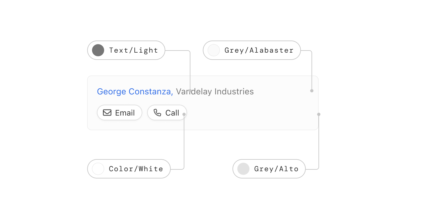
Previously, we used “paint chip” names for a lot of our colors (e.g.,
Grey/Alto, Grey/Alabaster).
This method was popular several years ago and while the names were distinct, they didn’t communicate anything particularly useful about the colors and their relationship to each other.
As our design system matured, we started to introduce colors using semantic
naming (e.g., Text/Light), more in line with where we wanted to go.
What’s the new structure?
The new color system is built on color ramps. A ramp represents a sequence of shades (from light to dark) within the same color family.
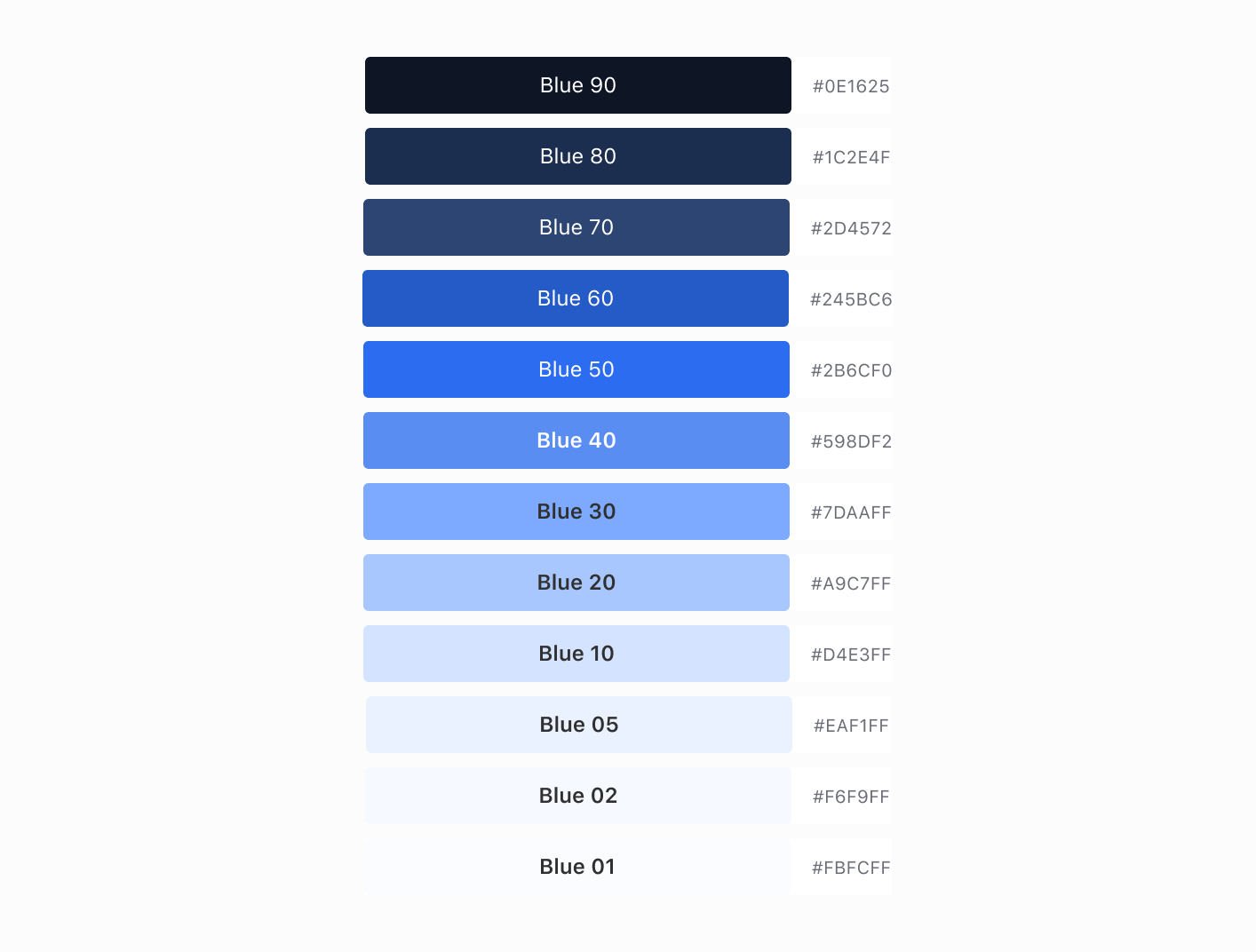
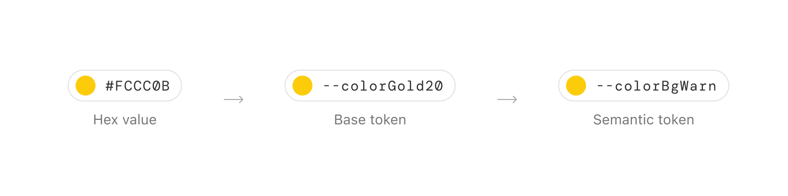
Each color/hex value within a ramp is identified by a base token, which can then be referenced by semantic tokens.
Base tokens don’t indicate how the color should be used. They only identify
which color group/hue the color belongs to and how light or dark it is. For
example, --colorGold20 describes both the group/hue (Gold) and its
lightness/darkness (20).
Semantic tokens reference the base tokens, providing colors in our system with meaning and predictable behavior. They communicate how our colors should be applied to our components. They also ensure consistent theming across the application, by allowing us to assign different values for various interface themes (e.g., light mode, dark mode).
I’ll give an example of how we structure our semantic tokens later. First, let's build our color ramps.
Building a ramp… a color ramp
The color ramps in our new system are created using the LCH (Lightness, Chroma, Hue) color model, instead of HSL (Hue, Saturation, Lightness).
This is because in HSL, colors with different hues and the same lightness value can be perceived as different levels of lightness by the human eye.
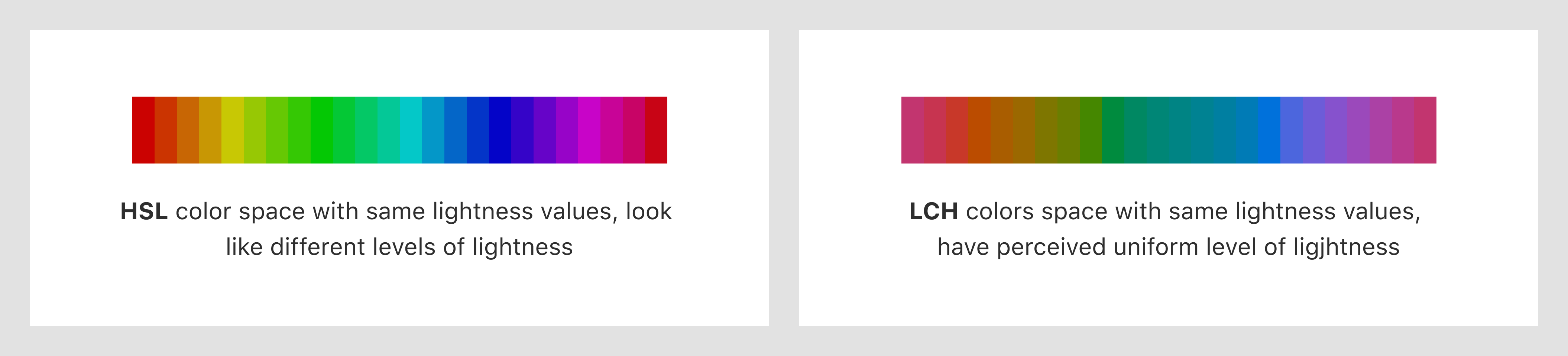
We used a color picker to generate colors with consistent perceived lightness in each ramp, ensuring we have enough shades to handle any contrast issues and meet WCAG AA standards (minimum contrast ratio of 4.5 to 1).
By maintaining the same lightness values across different hues, we then adjusted the chroma to suit our specific use case for each color.
For example, we increased the chroma in the middle of the red color ramp to create more saturated reds for error states.
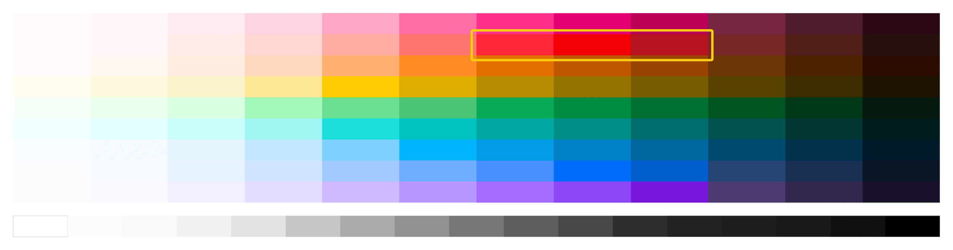
After creating the color ramps, we converted them into our base tokens. Each
token is named using a color and lightness level convention, such as
--colorGray10. This naming convention provides a clear understanding of each
color’s position within its ramp.
Semantic token naming convention
The semantic tokens reference the base tokens and provide the context for their usage, making it easier for our team to maintain consistency across the application.
The structure of a semantic token starts with the element it is applied to, such as a background, text, icon, fill, or border. Then the component the element belongs to, which may have variants and additional states.
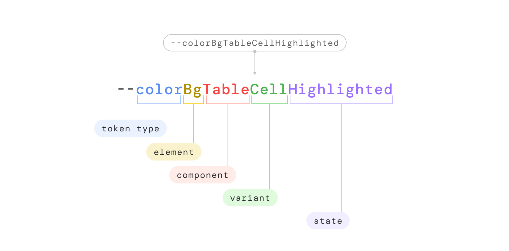
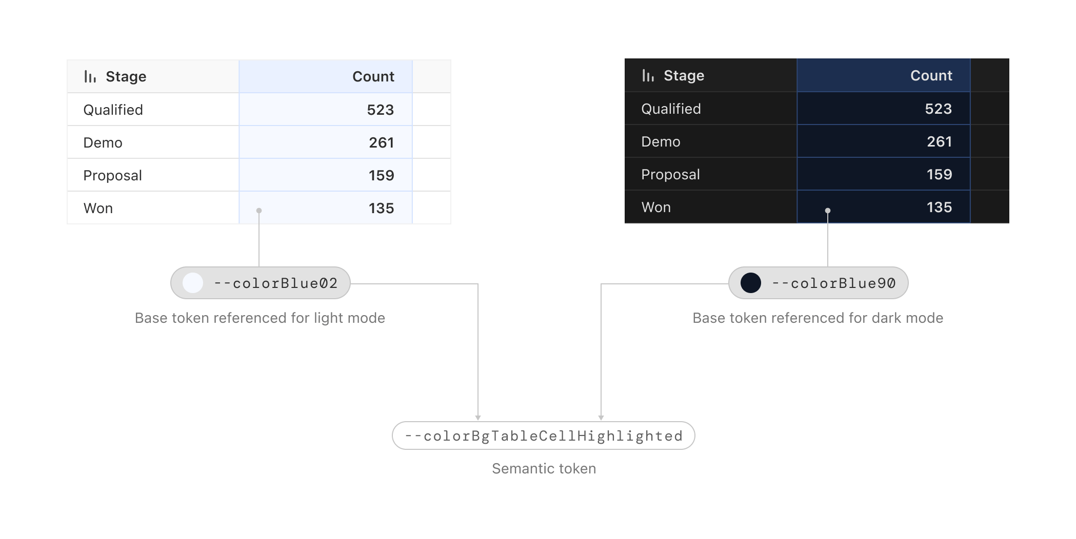
For example, consider the semantic token --colorBgTableCellHighlighted
- Token type:
color - Element:
Bg(short for background) - Component:
Table - Variant:
Cell(the table component has variants like header or cell) - State(s):
Highlighted(the variants of the table could have states like default, hover or highlighted)
Integrating the color tokens into Figma and the code base
Using Figma variables
We utilized Figma's Variables feature, which allows us to add base tokens as variables along with their corresponding hex values. The beauty of Figma Variables is that we can directly reference the base tokens, when adding our semantic tokens.
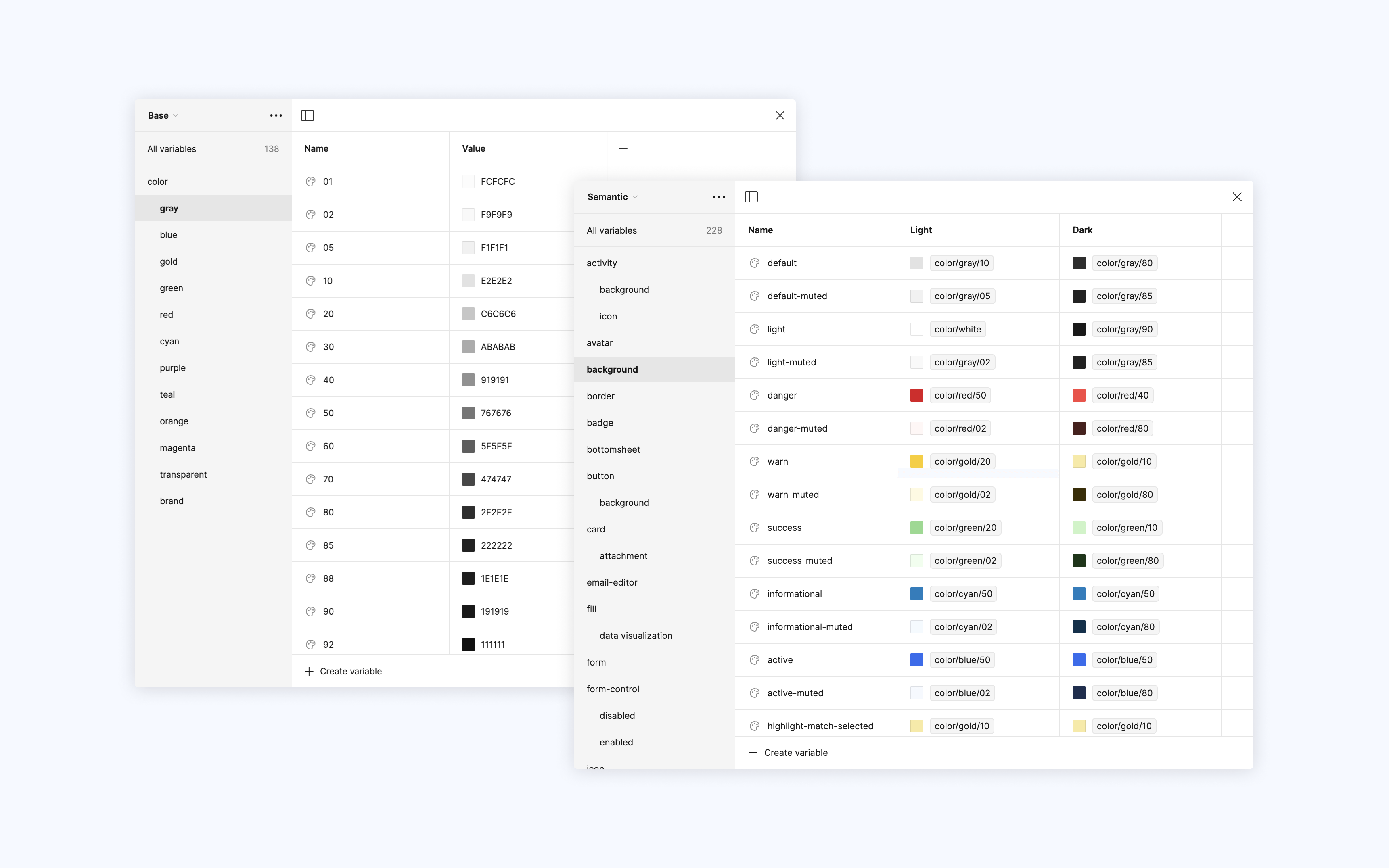
Each semantic token can have multiple values in Figma, enabling us to assign two values to each semantic token for the light and dark themes.
For example, the semantic token --colorBgTableCellHighlighted references
--colorBlue02 in light mode and --colorBlue90 in dark mode.
This feature allows us to apply colors to our components and switch between themes effortlessly.
Integrating into the codebase
We created a stylesheet with CSS variables for the base and semantic tokens. The base tokens have their values set to the corresponding hex codes.
:root {
      // Examples of base tokens from the Gray color ramp
      --colorGray01: #FCFCFC;
      --colorGray02: #F9F9F9;
      --colorGray05: #F1F1F1;
    }
The semantic tokens are defined with separate sets of variables for light mode
and dark mode, using the prefers-color-scheme media query to switch between
them.
/* Showing semantic tokens for texts and the base token they reference in light and
    dark mode */

// Light mode
:root {
    --colorTextDefault: var(--colorGray80); /* Default text color for light mode */
    --colorTextMedium: var(--colorGray60); /* Medium text color for light mode */
    --colorTextLight: var(--colorGray50); /* Light text color for light mode */
}

// Dark mode
@media (prefers-color-scheme: dark) {
    :root {
    --colorTextDefault: var(--colorGray10); /* Default text color for dark mode */
    --colorTextMedium: var(--colorGray30); /* Medium text color for dark mode */
    --colorTextLight: var(--colorGray40); /* Light text color for dark mode */
    }
}
Now to the battlefield 🛡️
We replaced the old color variables with the new system, updated the colors our components referenced, and then went page by page on mobile to rectify visual issues and identify parts of the app still using the old color values.
During testing, we evaluated the new colors to ensure they met accessibility standards and worked well in various contexts, both in light and dark modes.
Moving forward
While the scope of this project was to support dark mode on mobile, our new color system will also make it much easier to roll out to our web and desktop apps. The mobile app served as a good testing ground to determine if this approach would work well, which it did. 🙂